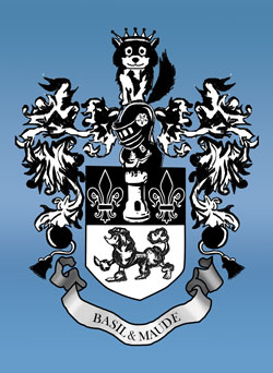
 Note: My decision to take the pencil sketch and redraw and ink it in Photoshop over the objections of the assistant sales manager for the line who said the sketch’s roughness was “why we liked it,” was vindicated when the sales manager said she liked it, but needed the background to be a blue gradient to match the backgrounds of the models in the brochure. Woohoo! And just another note: Photoshop CS2 is a real dog on my cheap work computer. My uncle Bruce Holloway is a professional illustrator. We visited him this summer while we were out in New Hampshire. He has this beautiful state of the art Mac and Photoshop setup, and he works on the second floor of a reconverted old barn with floor-to-ceiling windows looking out over picture-postcard rural New Hampshire beauty.
(Getting off on a tangent here, sorry). Uncle Bruce was working on a duck stamp for the feds when we were there. He’s done them for the state of NH a few times, but this was his first time at the national level. Unfortunately, it looks like he was eliminated in the first round of judging. Keeping us Holloways held down by the Man is the only explanation I can think of. I don’t see anywhere that has copies of the pictures sent in for judging but seeing the original… my kids were astonished that someone to whom they were related could do such beautiful art.
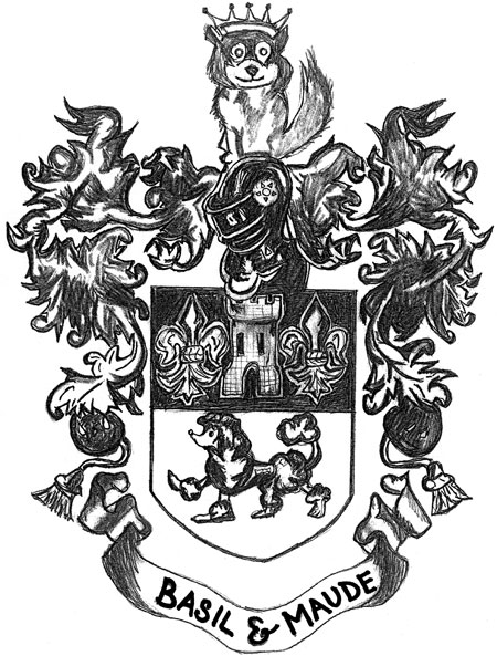
For the cover of our new Basil & Maude brochure, the people in charge wanted a pencil sketch someone drew. Thinking a pencil sketch wouldn’t be the nicest thing in the world, I decided to try and improve it. Bringing it into Photoshop and playing with levels and threshhold couldn’t hide that it was a pencil sketch with some things that really needed correcting.
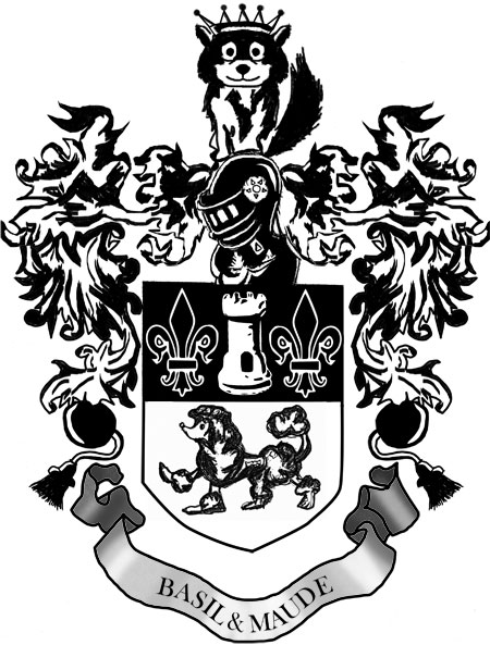
I’ve never inked a sketch before, so the inking was an evolution of technique as I experimented with things you could do with paths and Photoshop’s wide range of useful brushes. Inkscape handled the crest pretty well (the fleur-de-lys and the rook; the poodle was also Inkscaped but it isn’t obvious). I also had it do the fit-text-to-path for the banner at the bottom. Everything else was tracing and inking in Photoshop. I duped the left side stuff for the right side, and made the dog on top’s face symmetrical as well.
It was a lot of work — about three hours worth — for something which looks identical to the original. Except the inked one looks a LOT better in the brochure.
I definitely have a new appreciation for comic book inkers… artists every bit as important and creative as the ones that pencilled the originals…
Here’s the original.